Sunday, July 12, 2009

The Cover Story--from first roughs to final design (pt. 1)

BIG NEWS: We have created a cover design that got the thumbs-up from our editor, art director, and an imposing "cover committee" at Abrams Books!

The colors aren't finalized yet, but we've been given the blessings of our editor to unveil it here to the world...


David and I have been through many design schemes in an attempt to get a cover that's aesthetically pleasing and commercially appealing. In the publishing world, you often CAN judge a book by its cover. The cover has to somehow get across the essence of the book.

At a glance, it must suggest to the casual browser that this is IT--this is a book he or she must buy!

The art of cover design walks a thin line--between hucksterism and artistry, between commerce and creativity. The best covers achieve both goals, without one overpowering the other.

I hope we've gotten in the ballpark with this approved design.

We'd like to share with you some of our early cover schemes we came up with. This will take more than one post, but we hope you find it of interest.

Our first "cover" was a promotional piece David penned for our literary agent, Bob Mecoy, back when the book was still being shopped around. Bob now owns the original art to this piece. It's an image of the Carters sitting on the bumper of a car. You can find it HERE.

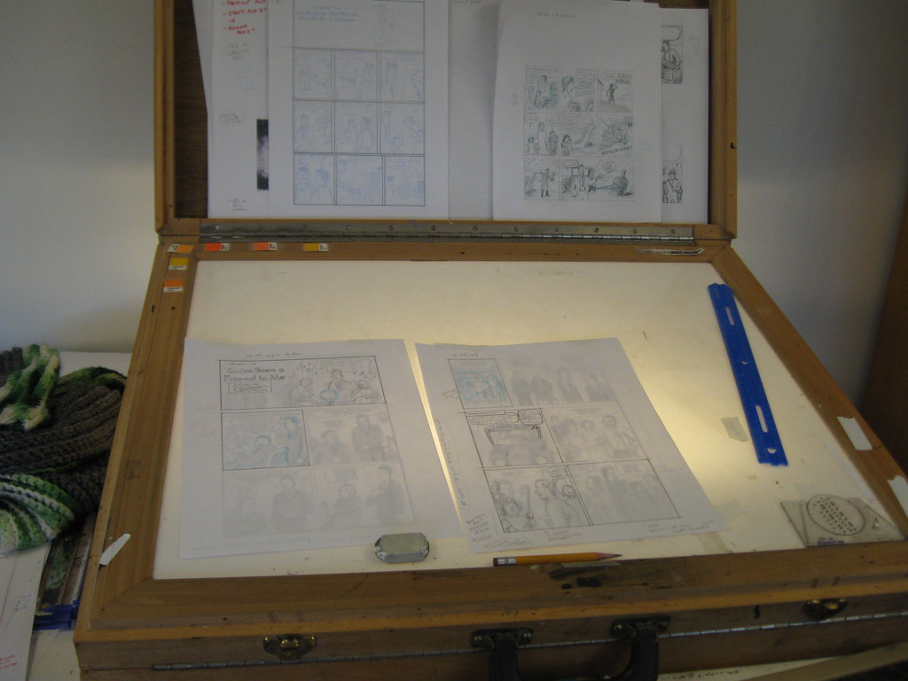
First, here is a selection of off-the-cuff thumbnail designs, from last fall. They're by David (left side) and myself (right side). These were among our first rough concepts of how the cover might look with a '30s flavor, bordering on Art Deco...


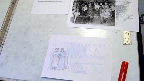
Later in 2008, David worked up our first developed concept for the cover. Our concept was to have a portrait of the three Carters, with their instruments--a very simple scene. David came up with an alternate that showed a background of trees.

These are his development sketches of this first cover design:


From these sketches, David worked up some color images of both styles...


These are nice drawings, but we felt that, ultimately, this approach didn't "sell" the story or reveal much about the characters.

David came up with this intriguing "autoharp" design as another possible approach....


Inspired by sheet music of the Depression era, I attempted a color rough with an tall, thin vertical area for the portrait of the Carters...


This design refers to the color palette of our first "cover," which was in the first Carter Family story that appeared in KRAMER'S ERGOT in 2002. That image was based on a 1930s Carter Family songbook published by Southern Music.

It worked as an image printed inside a book. As a front cover, David and I both felt it wasn't right to use--it was someone else's design.

Our editor really liked the color palette of this cover--the autumnal hues of brown and gold-orange. Those colors seem to suit the Carters. It's possible that they may end up in the final cover palette of the accepted design.

David's next design strongly incorporated certain visual symbols from the Carter Family story. This was also inspired by period sheet music. These colorful pieces are often beautifully designed, with great type treatment and use of hand-drawn fonts.

Typically, one image from a song would appear on the cover. In both pop and country songs, the image of the "cabin in the cotton" was ever-present on these vintage covers. As well, images of flowers and trees are quite common.

These images were germane to the Carters' story. In this concept, we see A.P. Carter's birth cabin, the apple tree A.P. planted on the day he met Sara Dougherty, and some wildwood flowers...


This design combined many of the visual motifs that would end up in the final version. It still seemed not exactly "there." We had some good conversations with our editor, Charlie Kochman, and our art director, Neil Egan, about how to best utilize these narrative images.

David and I both knew a good design lurked within all these possibilities. The challenge was to get the right blend of these elements into one appealing image. Some trial and error--including a couple of out-of-left-field, "what the heck?" designs by myself, had to happen first.

As well, I had a long, rewarding conversation with Art Spiegelman about the cover... details about that and other design attempts in our next exciting chapter!

TO BE CONTINUED...

Friday, July 10, 2009

Me (David) in the Studio

The esteemed illustrator, Sarah McIntyre, recently visited Seattle from her home in London, and came by the studio where Frank and I are working on Don't Forget This Song. Here is a photo of me that Sarah took (Frank had already left for the day).

Frank and I have been busy with cover design, coloring and inking (though I've been neglecting the inking of late). We'll have more to show and talk about very soon...

Monday, June 15, 2009

Page One

Big News: Frank and I have completed the rough draft of the entire book. We are beginning the inking and coloring phase of production!

On Friday (6/12/09) I worked on preparing page one to be inked. The sheet you see with the blueline art which has some penciling on top of it is a portion of page one. Up above it is a vintage photo of the Carter and Bays families gathered together ca. 1900. I am using the photo as reference when I draw AP's parents and relatives, many of whom will appear in this brief opening scene of the book.

Saturday, May 16, 2009

Carter Family 101

This 10 minute clip from a BBC documentary does an excellent job of summing up the story of the Carter Family and the lasting influence they have had. I believe the title of the program was "Lost Highway".

The group shown performing live is The Whites. You have probably heard their redition of "Keep on the Sunny Side" which is on the soundtrack to "O Brother Where Art Thou".

The group who appears in the recreation of the Bristol Sessions is the cast from a musical called "Keep on the Sunny Side" which I hope to be able to see one day.

My favorite part of this clip are Carter Family home movies from what looks like the late 1950's.

Sunday, May 10, 2009

Mother Maybelle Carter: Celebrating Her Centennial

Today marks the 100th anniversary of the birth of Maybelle Addington Carter. We wanted to mark this historic occasion on our blog. Maybelle is the anchor of the Carter Family's music. Without the vigor, inventiveness and passion of her guitar playing, and her vocal harmonies, the music of the Carters, while still outstanding, wouldn't have seemed quite complete.

Of the Carter Family's three members, Maybelle seems to me the most relaxed and assured. I'm impressed by how dedicated she was to her family and to her music. As well, it's remarkable how focused she remained throughout her entire musical career--but especially during the dramatic era of the original Carter Family.

Maybelle's marriage to A.P.'s brother Ezra (Eck) was much more stable than the heart-breaking relationship between A.P. and Sara Carter. While A.P. and Sara struggled, both emotionally and financially, Maybelle and Eck seemed to be blessed with a far happier and more peaceful existence. This contrast in the married lives of the Carters is among the most dramatic aspects of their story.

As Sara's friend and relative, Maybelle certainly was privy to the ups and downs of her colleagues' marriage and musical partnership. I'm glad that Sara had such a true friend and soul-mate in her life. Maybelle was a constant and stable influnece for Sara.

Sara and Maybelle meshed remarkably as musicians, throughout their lives. The interplay of their voices and their instruments can be hypnotic. In the superb remasterings of their Victor material by Richard Nevins, on the big, handsome Bear Family box set (and, in pirated form, on the JSP collections), their contributions to the Carter sound are stunningly revealed.

A recent discussion with Mike Seeger reminded me of the extraordinary style of their vocal harmonies. [Sorry for the "music talk" here, if it's all Greek to you.] They sometimes sing in sunny thirds--the most common and simple harmonies found in country music. But they often take surprising turns. At their most adventurous, they utilize seconds, fourths, fifths, sevenths and unison singing--often shifting from mode to mode within a verse or chorus of a song.

In layman's terms, Sara and Maybelle weren't afraid to go to unusual places with their singing. As we know the Carter Family was a well-rehearsed unit, these complex and advanced harmonic touches weren't just improvised in the studio. They might have realized that this was a way to keep their music fresh and exciting, even as their recorded sound settled into a reliable formula.

You may have read my earlier post on my "top ten" favorite Maybelle guitar riffs. If not, please search for that post. It would fit into this piece fairly well.

Maybelle expressed herself divinely through her guitar and voice. I feel that she must have been able to channel all the emotions around her and transform it into the music she played. Emotions seem to flow through her fingertips in her eloquent performances.

Speaking of those hands, here is a photograph from Eric Schaal's 1941 LIFE magazine session. We see Maybelle has a capo on her guitar. This device, colloquially referred to as a "cheater" by country musicians, enabled her to play in a wider range of musical keys--those optimal for Sara's vocal range--while staying in familiar, easier-to-navigate chord shapes.


If only these photographs had appeared in the December 8, 1941 issue of LIFE, as originally planned! Schaal's images are the best photographs ever taken of the original Carter Family. Here is another Schaal shot I really like. Maybelle's facial expression makes it seem that she really enjoyed her role in the Carters:


It's also Mother's Day--how appropriate! And I've saved the best for last. Here's a sketch of Maybelle by David. Enjoy!


Please, take some time today to listen to her music. Be it the classic Carter Family material, her 1960s LPs with Sara Carter, or the more pop-orientated Carter Sisters & Mother Maybelle sides (hard to find these days!), Maybelle's music will brighten your day and make the world around you a better place to be.

Happy Mother Maybelle's Day to you all!

Tuesday, March 31, 2009

A Sample Chapter from DON'T FORGET THIS SONG

We're currently at work on the final third of the rough draft of our graphic novel. Currently, David is translating the quick sketches of our thumbnail drawings to more fully realized pencil drawings.

As each page of pencil art is completed, I scan it into our computer. In PhotoShop, I type in dialogue.

Don't worry--the finished version will NOT use the Comics Sans font! We picked this font simply because it's easy to read, and somewhat approximates the feel of handwritten text. It's a handy way to see if dialogue works, or needs either expansion or reduction.

The first two "acts" are dialogued and penciled. They have been thought and re-thought. Sequences that once seemed likely to be in the book have been removed, while new material, based on information we've found through recent research, has found its way into the story.

We will likely make more changes, as new information comes our way. I've done some phone interviews with various friends, associates and members of the present-day Carter family. It is a pleasant experience to talk to these kind folks, and each interview has yielded some precious new pieces of information. We're grateful for the opportunity to learn something new from our interviewees.

With the blessing of our editor, Charles Kochman, we're happy to present you with a little sample of the book. This is the second chapter of the first act of the book.

This sequence takes place before A.P. Carter meets his future wife, Sara Doughtery. It's a sort of origin story for A.P. the song-hunter.

David evokes a strong sense of the passage of time in his pencil artwork.

We both felt this sequence well represents the early section of the book. We hope you'll enjoy seeing it.


Tuesday, March 24, 2009

Roughing out the book

Work continues on the rough draft of the book. We've completed Act Two, and only Act Three remains before we begin the finished art.


I've recently been using the light table to make revisions to Act Two (click on the photos to see them at full size):


After I finish the art, I hand it to Frank who scans it in to Photoshop and types words into the balloons:

Our editor has given us the OK to show some of our roughs, so in the next post we'll finally be able to show you a little bit of what we've been working on...